What's new

Modern Word Processor Discussion Thread

goodintentions

Active Member
It's been a long time coming. I actually didn't think I would ever publish it. But here it is.

Touch optimized word processor app. Trial has full access. I'll put out an update soon to add a few things like spell checker.

Please try it out and give me suggestions. Could really use a lot of it actually, as you can see I'm not that good with UI design.

Word Touch app for Windows in the Windows Store
 
Good first try GI.

Why thank you, sir.

I didn't want it to be just another text editor app. Plenty of that around. I wanted to see how close I can get to MS Office if it had a touch optimized version.

I meant to publish the version with page orientation control, though. Still kicking myself for uploading the version that only has portrait mode. Next update, I guess.
 
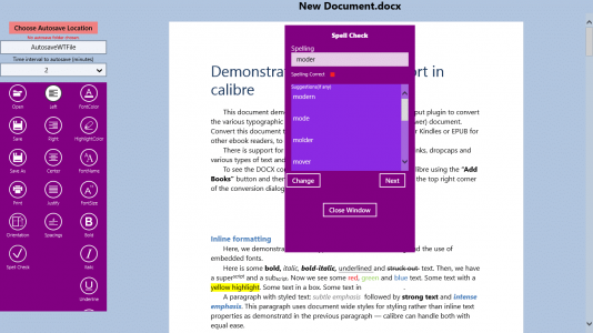
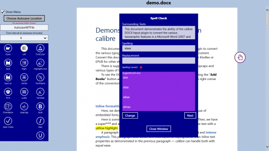
Just added a spell checking function like the one in MS word processor. Trying to wrap a C++ API in a C# program almost killed me, though.

3.png
 
Just released another update. Vastly improved the spell checker. Made the spell checker window movable so you can drag it anywhere you want. Also made the menus collapsible so the user can view in full screen mode. And changed UI background color. Someone told me the purple is kinda ugly. So, I changed it to blue.
3.png
4.png
 
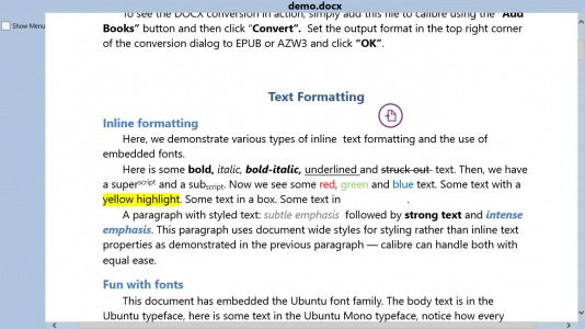
I just changed the UI to make it more aesthetically pleasing. No more bright colors.

Updates include but not limited to: full screen mode, read-only mode, word count, spell checker, ability to open multiple documents through tabs, etc.

A question for you guys. About the tabs for multiple documents reading and editing, I first put the tabs on top. But when I tested it on my 8" tablet, I felt really claustrophobic. So, I sent the tab bar to the bottom and it felt a lot better. What do you think? Where do you think the tabs should be? Remember that I'm aiming for this app to be both tablet and PC friendly.

6.png


Also, what do you think of the new UI? It's suppose to be more pleasant to the eye.

3.png
 
Here's and idea: The ability to change the background color.
Also, is this program multilingual ?
Good ideas. I will add the background color choices in for the next update, which will be sent out hopefully this weekend.

As for multi language support, it will probably come in a few updates.

See, while I'm jam packing this app with features, I'm also trying to keep this app as small and efficient as possible. If you look at the other word processing apps in the store, each is at least 6mb in size even though they don't have spell checker or any of the other features that I have. They have save and print, that's it. My app is about 1.7mb and it's got spell checker along with half a dozen other special features. I'm doing my best through special programming techniques to keep it as small as possible. So, I gotta be careful how I add things. Trust me, if I just add things for the sake of having them, the app would be like 9 or 10mb by now.

Anyway, I'm still working on multi language support without making it bloat too much. We'll see.

Other suggestions?

Added by edit.

One of the features for the next update is being able to view 2 documents at the same time. And their "windows" are resizable. No, I'm not talking about multiple views like metro internet explorer. I implemented multiple views in one of my LOB apps and all it did was confuse the hell out of people. So, I'm gonna try something new to see if having multiple windows in the same view will be less confusing to people.
 
Last edited:
I think the multiple documents thing would work best with tabs, like in Chrome, and maybe drag the tab on top of a document to make them windowed?
 
I think the multiple documents thing would work best with tabs, like in Chrome, and maybe drag the tab on top of a document to make them windowed?
For now, the user can open multiple documents at the same time and can jump back and forth between the tabs at the bottom.

6-png.2460


What I'm working on right now is make the app capable of showing 2 documents side by side. How to implement this is what I'm working on right now.

First of all, I will not implement multiple views like what you can do with metro internet explorer. I did this with one of my LOB apps and all it did was confused the hell out of people.

So, the first option is to have 2 tabs visible at the same time side by side. I can code it so the user can move the boundary left and right, making one document smaller and the other bigger.

The other option I can think of right now is give the user the option to have a small, resizable, and movable window pop up in the app where it will contain the document of one of the opened documents. Behind it will be the currently in-view document.

Which option do you think is best for me to implement? I'll start coding for both tonight. May be once you guys see screenshots, it will be better to decide which is better.

I guess the point is back in college there were times when I worked on a paper while having another document opened for references.

*******************

In other news, while driving home from my office today, I realized how to code my app to add multi-language support for about 120 languages without significantly increasing its size. Right now, it is 1.7mb. I'm aiming for 1.9mb in size. To me, every kb counts.
 
Back
Top