Paul Chapman
Member
Impressions after nearly 3 weeks with #Win10 on my @surface Pro 3 - Tablet experience is a HUGE DOWNGRADE from Windows 8.1.
I really do like the Desktop Mode, and believe it is a huge improvement over Windows 8.1, but now I feel Windows 10 in Tablet Mode really needs some work. My Surface Pro 3 in Tablet Mode just does not have that same fluidity and elegance that I experienced under Win 8.1.
So here is a list of things for starters that I would like to see addressed in Windows 10 Tablet Mode.
1. Auto-hide taskbar option.
This should have been included in day one. Tablet users did enjoy the "immersive" screen viewing that was Windows 8.1 in Tablet Mode. Having the taskbar auto-hide when located at the bottom of the screen in Tablet Mode is a must to maintain the same UX we enjoyed under 8.1.
2. Separate Taskbar on-screen Location Options for Tablet Mode.
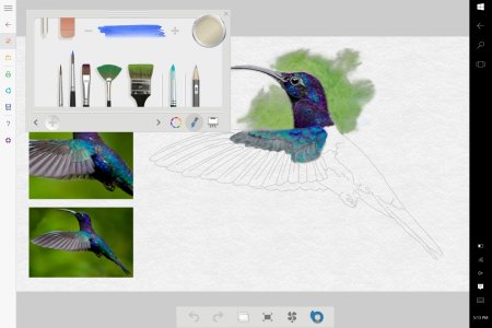
When in Tablet Mode, I've found having the Taskbar located on the right side of the screen is ideal for touch usage. This then places "search" along with "WiFi" and "Volume", accessible with a right thumb press, and the "Action Centre" with its quick access buttons accessible with a swipe in gesture from the right, almost mirroring the "charms" menu options previously available from a right edge swipe under Win 8.1.
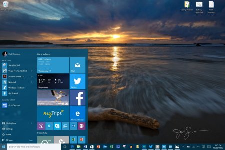
I'd like to be able to set the Taskbar at the bottom when in Desktop Mode and at the Right-edge, when in Tablet Mode.
This should then auto-locate the Taskbar when switching between Tablet and Desktop modes.
Desktop (Taskbar at Bottom)
Tablet Mode (Taskbar at Right)
3. Fix Snap.
a. It is currently broken for many Win8.1 apps. E.g. Kindle produces a vertical letterbox effect when snapped.
b. Task Switcher breaks Snap layout. In Windows 8.1 two or even three apps could be snapped, and switching from the snapped layout to another app would not break the layout of the snapped apps. You could switch back to the snapped apps in one swipe. In Windows 10 Tablet Mode, switching from the snapped apps layout breaks the snap. We now have to recreate the snap payout every time we switch back from another app.
c. Bring back three app snap.
4. The "All apps" display should populate the entire screen in Tablet Mode, as per Windows 8.1. Yeah, I know, its a "hamburger" menu thing. But at least when "All apps" are selected in Tablet Mode, spread the hamburger menu display area across the full width of the screen. That would do.
5. Bring back charms.
I really do like the Desktop Mode, and believe it is a huge improvement over Windows 8.1, but now I feel Windows 10 in Tablet Mode really needs some work. My Surface Pro 3 in Tablet Mode just does not have that same fluidity and elegance that I experienced under Win 8.1.
So here is a list of things for starters that I would like to see addressed in Windows 10 Tablet Mode.
1. Auto-hide taskbar option.
This should have been included in day one. Tablet users did enjoy the "immersive" screen viewing that was Windows 8.1 in Tablet Mode. Having the taskbar auto-hide when located at the bottom of the screen in Tablet Mode is a must to maintain the same UX we enjoyed under 8.1.
2. Separate Taskbar on-screen Location Options for Tablet Mode.
When in Tablet Mode, I've found having the Taskbar located on the right side of the screen is ideal for touch usage. This then places "search" along with "WiFi" and "Volume", accessible with a right thumb press, and the "Action Centre" with its quick access buttons accessible with a swipe in gesture from the right, almost mirroring the "charms" menu options previously available from a right edge swipe under Win 8.1.
I'd like to be able to set the Taskbar at the bottom when in Desktop Mode and at the Right-edge, when in Tablet Mode.
This should then auto-locate the Taskbar when switching between Tablet and Desktop modes.
Desktop (Taskbar at Bottom)

Tablet Mode (Taskbar at Right)

3. Fix Snap.
a. It is currently broken for many Win8.1 apps. E.g. Kindle produces a vertical letterbox effect when snapped.
b. Task Switcher breaks Snap layout. In Windows 8.1 two or even three apps could be snapped, and switching from the snapped layout to another app would not break the layout of the snapped apps. You could switch back to the snapped apps in one swipe. In Windows 10 Tablet Mode, switching from the snapped apps layout breaks the snap. We now have to recreate the snap payout every time we switch back from another app.
c. Bring back three app snap.
4. The "All apps" display should populate the entire screen in Tablet Mode, as per Windows 8.1. Yeah, I know, its a "hamburger" menu thing. But at least when "All apps" are selected in Tablet Mode, spread the hamburger menu display area across the full width of the screen. That would do.
5. Bring back charms.
Last edited:
