Start screemshot
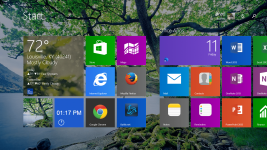
Here is a stitched screenshot of my SP start screen. I'm a minimalist so I try to keep it as basic as possible. Just a couple of things I want to point out.

Here is a stitched screenshot of my SP start screen. I'm a minimalist so I try to keep it as basic as possible. Just a couple of things I want to point out.
The white line indicates the physical dimensions of the screen on start-up. As you can see it cuts the Onenote tile in half putting it right at the right edge of the screen where it is still able to be touched. This placement is HUGE for me because I use Onenote so often. No matter what app (including desktop) I'm in, I swipe from the right to get the charms menu, touch the windows charm, and then touch the Onenote tile, wallah!! It's absolutely brilliant.
I love the live tiles. I have several stock quotes that I'm interested in on start up.
I just discovered pinning IE bookmarks on the start screen and I love the way they look. very nifty.
I don't like digging around my devices to find something I want to use so you can see how I pretty much use my Surface from looking at my start screen. However, I do use a few apps that aren't on my start screen and I have to say starting an app from the search function is just awesome. That feature might have been around for while but you have to remember, I'm coming from XP.


