What's new

Does Anyone Really Care About the Start Menu?

I don't use the start button or the start menu on my Work laptop, which is still running Windows 7. I use the windows button on my keyboard and start typing what I want to launch, just like I do on my personal Windows 8 machines. Much faster then navigating the ridiculous start menu on my company laptop. I like the direction Microsoft is headed with hiding the unnecessary clutter from my screen. All change to the UI have had a similar reaction of those that do not want anything to change and for those Windows leaves many opening for third party software to fill that need.
 
MS rationalization that no one used the Start Button anyway is as ludicrous as their claim that no one liked menus in Office 2003 so we needed to replace them with ribbons. Bottom line, MS is obsessed with big pretty pictures rather than functionality. They seek emotional response over intellectual response. This is why they designed a kickstand with only one angle because they liked the cool sound it made when closing it (this was actually their reason) instead of multiple angles people could actually use.

Now the rumor is MS will include the Start Button in 8.1 but it won't open a menu, it will simply take you to the Modern UI Start Screen. My god do they think we are children? People don't want the Start Button back because they like clicking big pretty buttons, they MISS THE FUNCTIONALITY. Get a clue MS.

With the Start Button you could do everything in a 2 inch square that you now have to fly all over the screen to do. If MS research showed them that no one uses the Start Button did that same research tell them people with mice were dying to hover over all 4 corners of their screen? Did it tell them people hated being able to do everything in one place but instead needed to spread those same tasks over 4 or 5 locations?
 
Last edited:
Mitch, MS isn't saying no one used the Start button. What they said is they noted a steep drop off in the use of the Start button by the majority of users and the way that people were using the Start button (two launch one or two items) could easily be accomplished in other ways. Again you are being overly dramatic talking about the mouse flying all over the screen ;) The truth is there are only 3 hot corners in Windows 8. The right two corners have the same action, they open the Charms bar. The upper left corner opens multi-tasking bar of open apps. Not coincidentally this can also be accessed by using Windows key + tab to cycle through open apps just like alt + tab cycles through open desktop apps and is a keyboard shortcut many people are familiar with. There are also plenty of keyboard shortcuts Win + C for charms, Win to toggle desktop and last app used etc.

This leaves just the lower left corner which brings up the Start screen. Guess what this one is located in the exact same position as the Start button was! No change necessary in where you have to wrestle your wild and unruly mouse to that hard to get at corner! In fact whether people want to admit it or not they already have to have their mouse "fly all over the screen."

Upper left corner - Internet browser back button, File menu and Office button
Upper right corner - Minimize, restore and close
Lower right corner - Scroll down, volume, clock, network connection etc.
Lower left - Start (button or screen), pinned apps

This is a little outside of the point of this conversation but learning just those 3 shortcuts (Win, Win + C and Win + tab) makes Win 8 very easy to use.

The same goes for the Office Ribbons. While you may not like them MS did studies that show the ribbons are more efficient once you get past the initial learning curve. I hate to break it to you but you appear to be in the minority of Windows users. What you are complaining about and wanting MS to change back would actually make Windows worse for the rest of us. The very thing you are accusing MS of, making things worse for the majority. Come on mitchellvii take one for the team and learn to use Windows 8 and Office Ribbons like the rest of us so we don't have to go back to the old tired ways of doing things. think of the greater good and the needs of the many instead of the needs of one :D

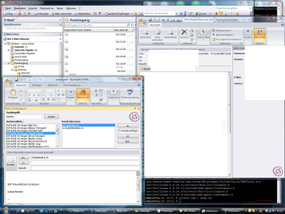
Random screen from image search:
osp2007.png
 
J5,

Honestly, I have had it up to here with MS's "studies" that tell them exactly the opposite of what people in my field (I'm an IT headhunter) tell me every day. I don't know who the hell they are focus-grouping but based upon Windows 8 reception so far in the marketplace, they weren't very representative.

My theory is that MS doesn't really do these "studies" at all or if they do they design them with a predetermined outcome in mind, sort of like global warming studies based upon models that tell them only what they want to hear. MS has a vision and therefore instead of designing their studies to tell them what the marketplace wants, they design them to confirm what management wants. If these studies by MS were successful Windows 8 would be a runaway success but it isn't, is it? At this point Windows 8 acceptance is making Vista look like a hit.

So these "studies" say Ribbons make me more productive? Bull. I don't need damned pictures of what I want to do spread over 6 ribbons in non-intuitive locations to be productive. Just give me a menu, thank-you very much. How can having to go to 6 different places to do something I used to do in one possibly make me MORE productive? How can using 3 corners of my screen instead of just one make me MORE productive?

But as I said, the proof in is in the pudding. Windows 8 sales suck therefore Windows 8 sucks - Ockham's Razor. You can rationalize it all day but if an OS designed to serve the marketplace isn't accepted by the marketplace it is a failure. You don't get points for trying hard. MS is trying to make us become them instead of them becoming us.

I only continue to use MS products because I have years of development invested in Office. If I could leave MS tomorrow I would. So I have to stay, but that doesn't mean I have to like it.

** Do you want me to put why Windows 8 fails into a simple phrase? "Live Tiles". There. Live Tiles are purely eye candy and serve no constructive purpose whatsoever. Once you get past the initial "Gee Whiz" they are just annoying. It's like designing the kickstand with one setting because it makes a cooler sound when you close it. This is all psycho-emotional-response-babble that adds nothing to productivity. It tries to make Windows 8 into a toy but if i wanted a toy I'd use Android or iOS. As a businessman I am looking for the shortest distance between two points. Windows 8 takes the long way around.
 
Last edited:
Honestly, I have had it up to here with MS's "studies" that tell them exactly the opposite of what people in my field (I'm an IT headhunter) tell me every day. I don't know who the hell they are focus-grouping but based upon Windows 8 reception so far in the marketplace, they weren't very representative.

My theory is that MS doesn't really do these "studies" at all or if they do they design them with a predetermined outcome in mind, sort of like global warming studies based upon models that tell them only what they want to hear.

I know you refuse to accept it but it is true. Do you ever see that opt-in to make MS programs better the first time you install Windows, IE or Office? They not only do studies (example Leaked Internal Kin Usability studies shows why Windows Phone is fast and smooth | WMPoweruser) but track thousands of users through these opt-ins. Real live data on how people actually use their PCS. Not wishful thinking about how to force users to an arbitrary design.

MS has a vision and therefore instead of designing their studies to tell them what the marketplace wants, they design them to confirm what management wants.

Well somebody certainly has a preconceived notion and tries to make reality fit to their ideas when it really doesn't ;)


If these studies by MS were successful Windows 8 would be a runaway success but it isn't, is it? At this point Windows 8 acceptance is making Vista look like a hit.

Not true for many reasons. Where do you find reports of Windows 8 being so far below Vista adoption? Particularly in a time of crisis for PCs in general which Vista didn't have to deal with. PCs were selling like crazy at that time and had nothing to do with Vista's lack of success.

So these "studies" say Ribbons make me more productive? Bull. I don't need damned pictures of what I want to do spread over 6 ribbons in non-intuitive locations.

They do indeed. Ribbons bring things to the front instead of burying them in menus. Windows 8 Analysis: Is the New Ribbon Interface More Efficient? | 7 Tutorials

Just give me a menu, thank-you very much.

That might work for you and a minority but why should the rest of us suffer text menus? :)

How can having to go to 6 different places to do something possibly make me MORE productive? How can extra steps make me MORE productive?

Not sure what this is in reference to but ok, it probably doesn't.

How can using 3 corners of my screen instead of just one make me MORE productive?

You don't have to use the 3 corners of your screen in Win 8 to be productive, but the fact is you are already using the four corners of your screen all the time unless you never run things in full screen. There is actually no change here from what you already do.

But as I said, the proof in is in the pudding. Windows 8 sales suck therefore Windows 8 sucks. You can rationalize it all day but if an OS designed to serve the marketplace isn't accepted by the marketplace it is a failure. You don't get points for trying hard. MS is trying to make us become them instead of them becoming us.

Simply not true. Windows 8 sales don't suck beyond the scope of how badly PC sales suck. Windows comes on PCs ergo if PC sales suck less copies of Windows are sold regardless of the OS merits.

Why is it that everytime MS makes a new release it becomes harder to use?

I guess because you don't adapt to change well. This isn't the case for all of us ;) You are entitled to your opinions but you clearly disregards facts that are contrary to your opinions.
 
Last edited:
Mitchelliiv - you've nailed it, the people you deal with....IT People, this is the same crowd who hated XP with its Fisher Price UI and Telli-Tubby inspired Wallpaper, dug their feet in and refused to upgrade off NT 4 workstation because it worked so well with their NetWare 4.11 Network using IPX/SPX now that same crowd that laments that they can have my XP when the pry it from my cold dead fingers. IT people hate change more than any other crowd, if left up to Corporate IT we would still be forced to use Desktop Replacement Laptops weighing 6+ lbs. running XP SP2.
 
Mitchelliiv - you've nailed it, the people you deal with....IT People, this is the same crowd who hated XP with its Fisher Price UI and Telli-Tubby inspired Wallpaper, dug their feet in and refused to upgrade off NT 4 workstation because it worked so well with their NetWare 4.11 Network using IPX/SPX now that same crowd that laments that they can have my XP when the pry it from my cold dead fingers. IT people hate change more than any other crowd, if left up to Corporate IT we would still be forced to use Desktop Replacement Laptops weighing 6+ lbs. running XP SP2.

Jeff, no offense but WINDOWS 8 IS NOT SELLING. Please open your eyes. It's not just IT people that hate the Modern UI, it is the public at large. As long as MS lives in denial that their "vision" is fatally flawed they will never make it better. IT people design for users and users are telling them they DON'T LIKE MODERN UI.

Not since the failure of "Hope & Change" have we seen a company so dedicated to the notion that change for the sake of change is good. Different is not always better. As a matter of fact, different is often worse.

If not by sales numbers, how does MS actually evaluate the success of a product? People are voting with their wallets and MS is losing in landslide. I am simply amazed that despite the horrifically bad sales of W8, MS continues to insist that they are right and everyone else is wrong.

** What MS should have done is have a desktop and a mobile version of Windows, like Apple does (to great success by the way). They could have included Modern UI on the desktop version as an option for those burning to try something new, but this "one-size-fits-all" approach is just a steaming pile of fail. It's not visionary, it's not the future, it's just dumb.

Think about this. What were two of the most popular aspects of Windows 7? The Start Button (despite MS "studies" to the contrary) and Aero. What did MS get rid of in Windows 8? The Start Button and Aero. It's like cutting Michael Jordan and Scottie Pippin and being shocked when ticket sales go down.

Let's face it, there is someone in Senior Management at MS that HATES menus. At every opportunity from Office Ribbons to Modern UI, MS is replacing menus with big clunky icons. Was there some sort of hue and cry from the public that menus are horrible and MUST be replaced? No, menus are easy. Windows 8 isn't.
 
Last edited:
Answers inline:
Jeff, no offensebut WINDOWS 8 IS NOT SELLING. Please open your eyes. It's not just IT peoplethat hate the Modern UI, it is the public at large. As long as MS lives indenial that their "vision" is fatally flawed they will never make itbetter. IT people design for users and users are telling them they DON'T LIKEMODERN UI.


No offense taken. Windows 8 is selling, actually at the same pace as Windows 7, and actually Windows 8 (x86) is trending very positive even with IT Professionals. I can’t share the actual data as I’m under NDA.

Not since the failure of"Hope & Change" have we seen a company so dedicated to the notionthat change for the sake of change is good. Different is not always better. Asa matter of fact, different is often worse.


Bottom line is the laptops are going the way of the desktop, will they completely die off, no but fewer and fewer people willbe using them. Tablets are the next step in the Pervasive Computing that is starting to mature, if MS didn’t push this direction they will be dead.Traditional Form Factors will die, replaced by Phablets and AIO’s and then to wearable or flat surface computing.


If not by sales numbers, how does MS actually evaluate the success of aproduct? People are voting with their wallets and MS is losing in landslide. Iam simply amazed that despite the horrifically bad sales of W8, MS continues toinsist that they are right and everyone else is wrong.


Upgrades have actually outpaced new PC sales, people are buying Windows 8. Surface and Surface RT actually bolstered MS financial results enough to offset their OEM community’s failure.


** What MS should have done is have a desktop and a mobile version of Windows, like Apple does (to great success by the way). They could have included Modern UI on the desktop version as anoption for those burning to try something new, but this"one-size-fits-all" approach is just a steaming pile of fail. It's not visionary, it's not the future, it's just dumb.


Actually leaked documents show that Apple is moving to same type of unified platform and so is Google, MS was first in unifying their OS Properties.

Thinkabout this. What were two of the most popular aspects of Windows 7? TheStart Button (despite MS "studies" to the contrary) and Aero. Whatdid MS get rid of in Windows 8? The Start Button and Aero. It's like cuttingMichael Jordan and Scottie Pippin and being shocked when ticket sales go down.


Other than the Bitch, Moan and Whine from forums like these, what evidence do have for the above statement? 26+ Billion Computers run Windows and these forums across the internet are mere fraction of the population. Forum Participants tend to be very vocal but not a majority.

Let's face it, there is someone in Senior Management at MS that HATES menus. At everyopportunity from Office Ribbons to Modern UI, MS is replacing menus with bigclunky icons. Was there some sort of hue and cry from the public that menus arehorrible and MUST be replaced? No, menus are easy. Windows 8 isn't.


It not that anyone hates menus, it is the fact the software has become more powerful and feature rich, menus became unruly because of the Cascading back and forth to the point of you are boxing with the UI, it was like bobbing and weaving and if you miss click it all collapses. This is why the ribbon came into being.
 
Last edited:
I've been in IT for maybe 12 years now. Started in helpdesk, server admin (Windows and Red Hat), Oracle DBA and now SQL Server DBA. I love the new changes to Windows. Most complaints I hear from other IT pros are from the help desk who don't want to deal with end-users going through the learning curve. The other concern in the corporate IT world is the slow pace of adopting new tech. We still have apps that don't work on 64 bit windows. Its going to be a while before corporate apps are all 100% compatible. For my personal use, I have Windows 8 on both of my home PCs, my laptop and my Surface RT tablet. I spend about 95% of my personal computing time on my Surface. My wife, who is a complete computing novice, has had a few growing pains, but now loves the update to Windows 8 on our home computers. She had a few issues at first, but I don't think I ever heard her complain about missing the start menu. The new start menu was one of the few things she liked at first.
 
Last edited:
I've said it a few times on here, MS had a choice. Adapt, push the envelope and try to move their customers along, or continue making the best desktop OS as they quickly fade into irrelevance. Yes, a lot of Windows user would be happier if Windows 8 was just a better Windows 7, but those customers would then buy an iPad or other tablet when their old desktop dies and move on to a competitor's product. A LOT of users who have actually taken the plunge love the new interface - even on a desktop with mouse and keyboard. We understand the future and where this is going. I really like that the interface on my desktop at home is pretty much exactly like the one on my Surface RT - I can buy an app once and use it on both.
 
I've said it a few times on here, MS had a choice. Adapt, push the envelope and try to move their customers along, or continue making the best desktop OS as they quickly fade into irrelevance. Yes, a lot of Windows user would be happier if Windows 8 was just a better Windows 7, but those customers would then buy an iPad or other tablet when their old desktop dies and move on to a competitor's product. A LOT of users who have actually taken the plunge love the new interface - even on a desktop with mouse and keyboard. We understand the future and where this is going. I really like that the interface on my desktop at home is pretty much exactly like the one on my Surface RT - I can buy an app once and use it on both.

Yeah...and I am one of those. I cold turkey'ed into the Surface RT and then immediately plunged into Win 8 Pro on my home machine. I do like the new interface and I like the continuity between my desktop machine the Surface. I also think that it is not the Surface Pro, but the RT that is the truly futuristic device. The key now is for MS to step up their game in terms of their store contents.
 
Back
Top