What's new

The Inexplicable Choices of MS...

and what about the possibility that a lot of what windows 8 and the surface are, is exactly what the people want? After all most everybody here did get a surface and has upgraded other machines to windows 8. For the majority here these aren't our first tablets and the upgrades were from windows 7. How do you explain all that? We were all brain washed by microsoft's excellent advertising? :) maybe we couldn't resist the single angle kickstand, overpriced keyboards and were willing to tolerate windows 8 and its lack of a start button just for those other features ;)

i c wut u deed dere!
 
I would hardly call the few respondents to this forum as representative of the marketplace who chose NOT to buy Windows 8 or Surface Pro.

Some people, like myself, purchased the SP as a stop gap. I needed a tablet that could run full OneNote and Office with inking now and this was the best athlete in the draft at this price point at the moment. That doesn't mean it will be my starting quarterback next season. As a matter of fact, once Haswell is out I will be surprised if I go Surface again. I need more of an ultrabook that can be a tablet than a tablet that can be an ultrabook. I promise you I won't be buying a Haswell with less than an 11.6 inch screen.

May I suggest: Convertible Ultrabook Laptop & Tablet PC | ThinkPad Helix | 11.6" with Windows 8 (US)
 

Yeah that's a sweet rig there. With all of the new tech around the corner, Haswell, flexible super high res screens, truly scratch proof sapphire glass, I may be using my Surface Pro for another 6 months at least as I wait to see what drops. Maybe MS will pull a genie out of the bottle with Surface 2 but they better bring game if they want to compete with some of the upcoming offerings from their competition.

Anyway, SP not ideal but will do for now. When I trade up my GF will likely get this. She is perfectly happy with all my old tech. I'll just have to show her how to use it as she found it confusing at first glance. Like 90% of users, she has no interest in expending energy to learn new technology.

This is why Apple is worth billions. They took Unix and made the interface easy sauce. No learning beyond simple clicks and linear menus. I just complied a setup guide for the iPads in our pilot, well I had someone compile it for me, and it was like 45 pages of Click next - the type this - click continue - linear and simple.
 
This is why Apple is worth billions. They took Unix and made the interface easy sauce. No learning beyond simple clicks and linear menus. I just complied a setup guide for the iPads in our pilot, well I had someone compile it for me, and it was like 45 pages of Click next - the type this - click continue - linear and simple.

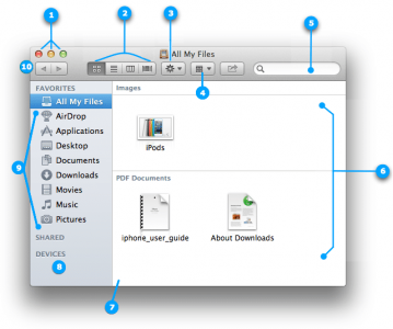
And no Start buttons by the way. I wonder how they made an OS millions love without Start buttons (although finder is like the Start screen in a window). Are those ribbons I see instead of menus :shocked::tongue:

HT2470_100----en.png
 
Surface Pro Photos by Arizona-Willie | Photobucket

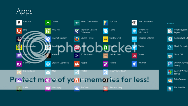
How did you get an app page like that? Mine never had letters on it like that. Above is what mine looks like.

Swipe up from the bottom of the Start screen an select all apps. Then pinch from out to in. It is too many steps to be truly useful in my opinion, at least compared to actual folders, but for people with tons of apps it might help a lot. Allowing just pinching to shrink without going to the all apps would help a lot. So pinch to shrink once see all tiles. Pinch to shrink again see all apps. Pinch to shrink a third time and see the index. Or pinch to shrink with more than two fingers to go straight to the index would be nice.
 
I'll be darned!!!

I had never seen that before!
There are indeed letters there that I presume a user can drag tiles to -- haven't tried that.
But I see that just touching one of those letters zooms me back out to my collection of tiles.
Hmmm wonder how to put a tile on a letter because the tiles are not on this screen.

More mysteries :)

I was surprised to find this too. It has potential but that is all it has. Currently it just jumps you to the alphabetical listing in your apps. So if you have 1000 apps and need to jump to Xbox you just touch "x". This may also be code needed more directly for Windows phone where this system works much better.
 
How did you get an app page like that? Mine never had letters on it like that. Above is what mine looks like.
But what a minute! What do you mean you don't have letters?! I know and I can see from your screenshot, but when I swipe from bottom to top and then select "All Apps," my list is alphabetized with the letters showing (when the first letter changes, the letter appears with a horizontal underline that stretches the width of the column).

Your screenshot, on the other hand, is just an alphabetized list. What actions did you perform to get that list?
 
I didn't DO anything. I just did it itself as I've added programs over time. That's why I was puzzled ... I had never seen those letters like on the OP'S screenshot. I'm not seeing anything like the behavior you mention. They are sorted alphabetically and then also broken out into program groups like for OFFICE 365.


But what a minute! What do you mean you don't have letters?! I know and I can see from your screenshot, but when I swipe from bottom to top and then select "All Apps," my list is alphabetized with the letters showing (when the first letter changes, the letter appears with a horizontal underline that stretches the width of the column).

Your screenshot, on the other hand, is just an alphabetized list. What actions did you perform to get that list?
 
Back
Top