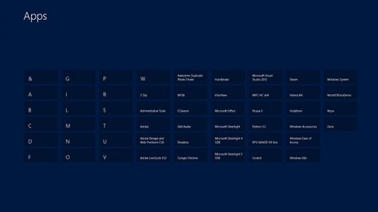
Overall, I like and am comfortable with the Modern UI but "brilliant" and "visionary" are certainly not words I'd use to describe it. :LOL:
The big frustrations that I would add to your list are:
7) TILE FOLDERS: The only way to organize tiles is to create groups. Thus, you have an ever-expanding, horizontally-scrolling set of tiles on the Start screen. Uggh!

The more organized you get, the more groups you end up creating, the more scrolling to the right you have to do, especially to get the icons of newly-installed apps so that you can move them into their appropriate groups. Awful! Yes, there's a zoom out feature, but it is still a ridiculous implementation. As it stands right now, I could not replicate my old Windows 7 Start menu structure on the Windows 8 Start screen because I'd have too many groups and the horizontal scrolling would be ridiculous, so I'm doing the best I can to minimize the number of groups I have on the Start screen. I'm "okay" with the setup I have, but without a doubt, I wish I had the folder-type drill-down capabilities on the Start screen.
8) TILE ORGANIZATION: Have you ever tried to organize your tiles? The first time I did, my immediate reaction was disbelief! I couldn't believe that someone thought that it made sense! I should be able to move around and organize my tiles within the group as I please. None of this two columns at a time nonsense or however it works. Totally awful! So I lose folder-organization capabilities and then it becomes an art to organize my application tiles. Absolutely ridiculous!

