J515OP
Super Moderator
I don't mind the split between Modern UI and the Desktop that many people have complained about with Windows 8. For me I see the benefits of each and have no problem jumping between them without a "jarring" experience. However, I do experience this complaint when it comes the the IE browser. I have used many different mobile browsers thanks to Android and there are certainly ways to make them more suited to touch devices.
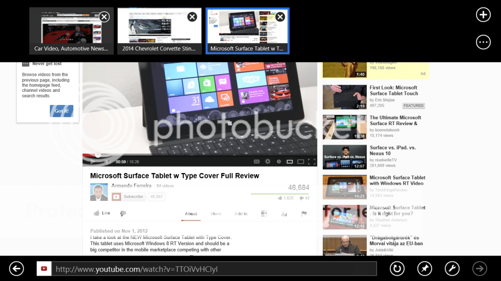
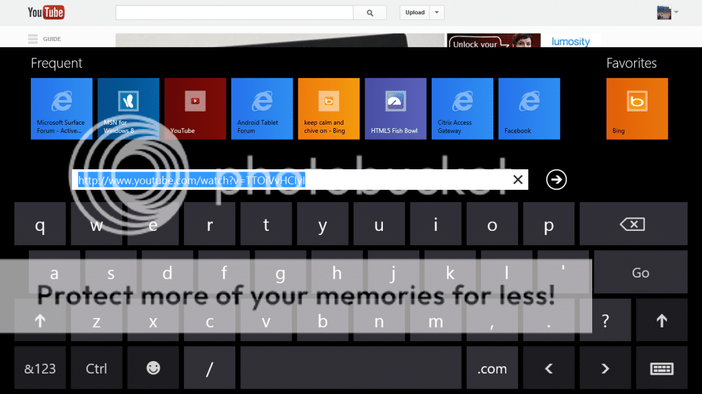
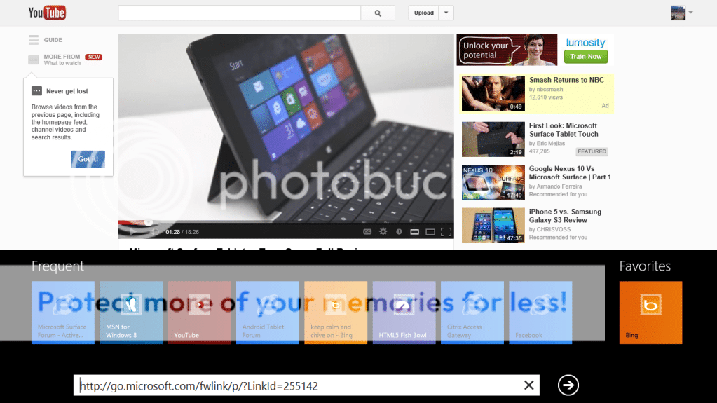
When it comes to the Modern IE app I just can't help but feel it is wrong. The swipe up/down method of accessing the tabs and address bar feels wrong and is inconvenient. You have the swipe left and right to go forward and back which are different than the forward and back buttons. The forward and back buttons are on opposite sides of the url bar (I rarely hold my Surface with hands on each side in a manner that would make this a convenience), the frequently visited sites and favorites are wonky and don't seem to be very efficient.
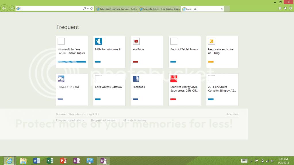
Even though it was "made for a mouse" I find the Desktop IE to be a much more usable browser even on a touch device. I like the forward and back being close together and the buttons and the address bar being readily available. The tabs, though traditional, work very well too allowing quick changes between them and letting you glance to see what is currently open.
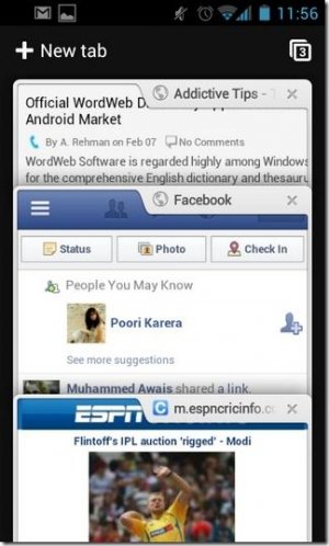
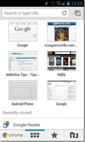
Google did a nice job on Chrome for Android with non-traditional tabs. They stack vertically and you can slide them up and down for a preview of what is on the tab. The favorites and bookmarks are also well done.
I tend go back and forth between Chrome and Dolphin on Android. I like that by simply touching the screen the back and forward buttons come up contextually in Dolphin Mini. If you can't go forward or back as in a new tab, no buttons. Go to one page and only the back button appears. Go to a second and go back and both buttons are now there. Go all the way forward or backward and only the button to go the other way appears.
Really there is no shortage of innovation when it comes to browsers on mobile devices and yet I think the traditional IE does a better job than the Modern IE. Here is a good example of the options for Android. (All sizes | Google rendered on a ton of Android browsers | Flickr - Photo Sharing!)

Let's hear what you think. Did MS get Modern IE right? Do you need both versions? Would you prefer something different? Is there a better way to use Modern IE? Are there a couple of small tweaks that would make all the difference?
When it comes to the Modern IE app I just can't help but feel it is wrong. The swipe up/down method of accessing the tabs and address bar feels wrong and is inconvenient. You have the swipe left and right to go forward and back which are different than the forward and back buttons. The forward and back buttons are on opposite sides of the url bar (I rarely hold my Surface with hands on each side in a manner that would make this a convenience), the frequently visited sites and favorites are wonky and don't seem to be very efficient.
Even though it was "made for a mouse" I find the Desktop IE to be a much more usable browser even on a touch device. I like the forward and back being close together and the buttons and the address bar being readily available. The tabs, though traditional, work very well too allowing quick changes between them and letting you glance to see what is currently open.
Google did a nice job on Chrome for Android with non-traditional tabs. They stack vertically and you can slide them up and down for a preview of what is on the tab. The favorites and bookmarks are also well done.


I tend go back and forth between Chrome and Dolphin on Android. I like that by simply touching the screen the back and forward buttons come up contextually in Dolphin Mini. If you can't go forward or back as in a new tab, no buttons. Go to one page and only the back button appears. Go to a second and go back and both buttons are now there. Go all the way forward or backward and only the button to go the other way appears.
Really there is no shortage of innovation when it comes to browsers on mobile devices and yet I think the traditional IE does a better job than the Modern IE. Here is a good example of the options for Android. (All sizes | Google rendered on a ton of Android browsers | Flickr - Photo Sharing!)

Let's hear what you think. Did MS get Modern IE right? Do you need both versions? Would you prefer something different? Is there a better way to use Modern IE? Are there a couple of small tweaks that would make all the difference?
Last edited:

