What's new

Charms bar doesn't line up

bamaster

Member
So here's a little nag. The Charms Bar.

When swiping with my finger and the Charms Bar pops out, it looks pretty good. But if I use my mouse, hold it in the top-right corner, then swipe down... the Charms Bar is off. The Window icon isn't lined up with the Window icon on the bezel. Like this.
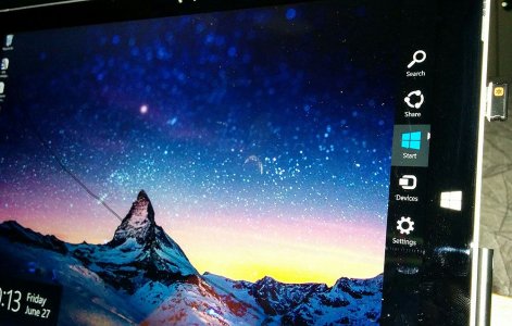
20140627_221343_Android.jpg


Weird!
 
So here's a little nag. The Charms Bar.

When swiping with my finger and the Charms Bar pops out, it looks pretty good. But if I use my mouse, hold it in the top-right corner, then swipe down... the Charms Bar is off. The Window icon isn't lined up with the Window icon on the bezel. Like this.

Weird!

I don't know this for sure, but I'm going to guess on this one. Honestly I believe it is a new FEATURE that MS came up with as part of the most recent Windows update. And it is sort of clever.

Think about it - if you use your mouse to open the charms bar using the upper right corner, the icons move up. Conversely, if you go to the bottom right corner, the icons move down. So the feature is this - the icons are a bit closer to your mouse cursor - you don't have to move it as far as you did before. So bottom right, the settings icon is right there - a little less movement of the mouse is needed.

Now on the Surface screen, it probably doesn't make that much of a difference. But if you are using a 27" monitor running Windows 8.1, it's makes much more of a difference.

That's my take on this - I highly doubt it's a bug, but something the programmers threw in to make things a smidgen faster.
 
Wow! is this so important? does the charm stop working properly because it's not perfectly aligned with the Windows hardware button?

Give Microsoft a brake!
 
This is a new feature in Windows 8.1.
Microsoft explained that this was done to reduce mouse travel.

If you do the do gesture from the bottom of the screen, now the icons will be lower.
 
This is a new feature in Windows 8.1.
Microsoft explained that this was done to reduce mouse travel.

If you do the do gesture from the bottom of the screen, now the icons will be lower.

I actually noticed that too, after I played around with it. I searched for some documentation about this but I didn't find anything. Good to know.
 
Hi, you must must be new here. Welcome to the internet.

His concern is legitimate. It is good to report these things, as it might be a genuine issue, and if it didn't got Microsoft testing, it might not be fixed... ever.
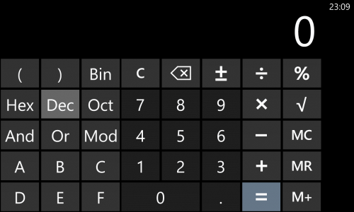
Like for example, if you open the Windows desktop calculator, and you hit: [4], [square root] [=], you'll get 2. Then you do [-], [2], you won't get 0. despite being 2-2.
This bug existed since Windows 1.

I do know why it doesn't show 0. But regardless it should be corrected.

good thing microsoft fixed the calculator bug in windows phone - by removing the square root sign :big smile:
 
I guess it's a Surface Pro 3 thing. It doesn't do that on my Lenovo X1 Carbon. And it has 2560 x 1440 resolution. Hmm...
 
Back
Top